Website Review #3 stumbled onto an early contributor to the M.U.S.C.L.E. community by connecting Chris Bores, the Irate Gamer, to early MPS newsletters. The subsequent review has also inadvertently stumbled upon an early M.U.S.C.L.E. community contributor, Tim Drage.
Tim Drage created the internet’s third M.U.S.C.L.E. website. His website will be fully reviewed in the future, but this video was found completely separate from his page and will be reviewed as an independent website. This review solely focuses on this entry to his YouTube page. The rest of his YouTube account has been ignored because it does not connect to M.U.S.C.L.E. in any meaningful way.

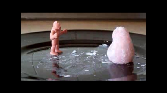
A 'scene' from the video.
Last Updated/Originally Posted:
Tim posted this video to YouTube on May 26, 2006.
Content: 4 out of 5
The concept of this admittedly silly video is simple. Muscleman (either M.U.S.C.L.E. figure #141 or the Wrestling Ring figure #234) fights a Japanese Mochi ball which appears to have a very similar Flesh M.U.S.C.L.E.-like color.
Design: 5 out of 5
This is a simple stop motion video with a few simple animations. Tim Drage and Helen Ingle made a very wise decision. They correctly chose the best object to provide action and motion. The M.U.S.C.L.E. figure does not need to be animated or moved, his static poses works in the short clip. Instead the Mochi ball is able to provide the movement.
They also kept the length of the video perfect. Quick edits and instant gratification have left internet viewers with attention spans that seemingly continue to shorten. 30 seconds is the perfect length for the video. Had it been shorter, it may have been too simple and lost some of the charm provided by the shifting Mochi ball. Conversely, had the video been longer, it would have dragged out far too long – as the limitations of a unarticulated figure would have been exposed.
The sound design is another key aspect of the video. The music at the front and back ends of the video fits and is not instantly recognizable. The intro music/sounds trasitions into a surprisinly fitting Mochi ball sound, which provides both character and a fullness to the video. The sword-like “tings” are humoours and fitting for the staredown and cutting of the Mochi. Even the choice to remain silent after the cutting of the Mochi added to the video. Only the quick sounds of the Mochi insides falling out and the simple eating sound of the M.U.S.C.L.E. figure are heard.
Pictures: 4 out of 5
The picture quality of the video is surprisingly good. The first ~6 seconds of the video seem to struggle with providing a constant lighting level, but the rest of the video is free from this constant change.
Overall: 5 out of 5
YouTube, and the internet in general, is filled with terrible and constantly amassing fan-driven media. Finding something this clever, original, and fun is certainly a treat. Coming to a consensus on the appropriate character of M.U.S.C.L.E. toys would be challenging. However, this video seems to properly capture the potential character of M.U.S.C.L.E better than any other M.U.S.C.L.E. video – including the original Mattel commercials.

