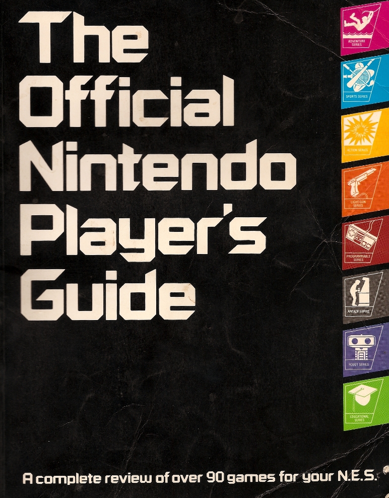
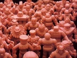
Cover
Admittedly, Mattel had internal issues which contributed to the discontinuation of M.U.S.C.L.E. toys. Nintendo was also a terrific product that appealed to a huge demographic.
However, by closely examining The Official Nintendo Player’s Guide a much clearer picture emerges regarding how companies like Mattel and Nintendo marketed to their clientele. Hindsight allows for a much clearer picture regarding the things that Nintendo did correctly regarding their brand, and the things that Mattel failed to do with the M.U.S.C.L.E. brand.
Inside Cover
The guide was so popular that it launched other Nintendo guides and, eventually, the monthly Nintendo Power magazine. So what made the original guide so popular?
Welcome Page
On the inside of the cover is R.O.B., who played heavily into Nintendo’s launch, and 18 screenshots of Nintendo games. This type of video game advertising had been heavily used since the earliest home gaming systems had been introduced. This is not intrinsically bad, as there is certainly an appeal to it, but it would have lessened the strength of the branding message if it had been used as the cover.
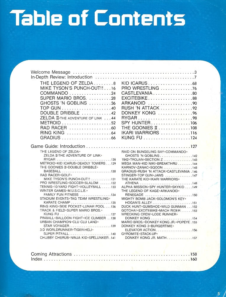
Table of Contents
The Table of Contents shows how the guide is organized. Again, Nintendo is masterful in showcasing the games. The, roughly, first 100 pages feature in-depth examinations of several games. By the time this guide was sold, Nintendo likely had a sense of which games were becoming the most popular based on sales. However, there was likely some very strategic positioning as well. Nintendo had three wrestling games it could have spotlighted, yet it chose its own Pro Wrestling game.
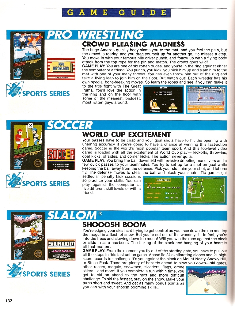
Pro Wrestling was given four pages in the guide.
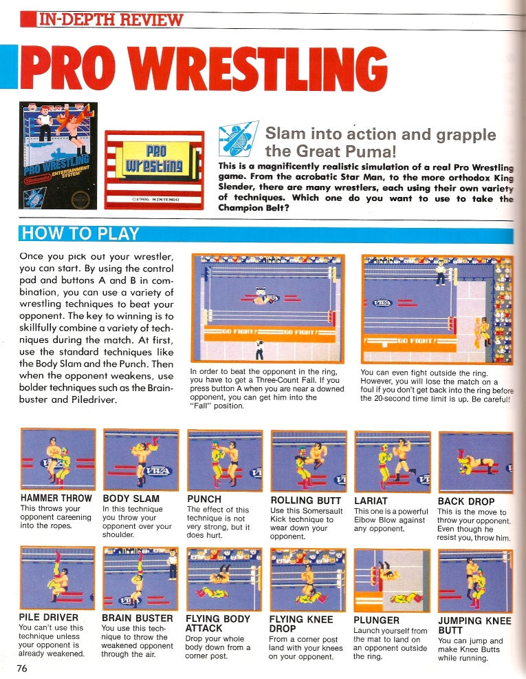
Page 76
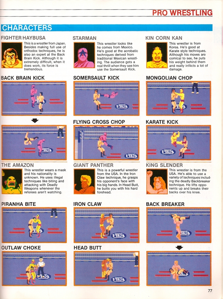
Page 77
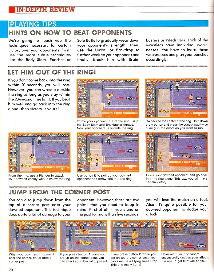
Page 78
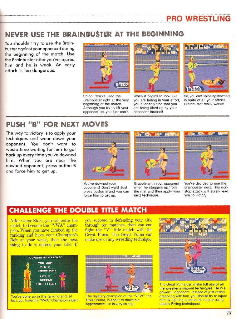
Page 79
The summary/explanation about the game is well written, but that trait is shared with many of the write-ups in the Guide – plus most advertising and game packaging of the time. The brilliance of the four pages is in making a very basic game seem both broad and deep. First, on page 76, the Guide shows there are two different ways to win. Yet Nintendo found a way to skillfully insert almost identical information on page 78. The second appearance of the information lists shares the information as a way to defeat an opponent. Information that had taken up a tiny fraction of page 76 suddenly engulfed more than half of page 78.
Pro Wrestling has a decent amount of moves for a mid-1980’s wrestling game. Visually it appears that there are 24 different moves because there are 24 picture boxes show casing the moves. Upon closer inspection some skillful marketing has taken place. For example, there are two moves (Flying Body Attack and Plunger) listed on page 76 which are the same move and animation. However, Nintendo has the move taking place in different locations making them appear somewhat different.
The six featured wrestlers also have their special moves listed under them. However, two wrestlers (Fighter Haybusa and King Slender) have only one move. Nintendo has simply shown two different screen captures of the moves.
These four pages are another example of Nintendo masterfully creating an identity and emotion for their product. This is something that Mattel always struggled to do with the M.U.S.C.L.E. brand. There is no question that the 10-pack garbage cans were attractive (although they may have been the result of convenience instead of inspiration) and that Mattel attempted to created attractive displays (which may have been inspired from He-Man displays). However, the same love, time, and effort was not applied. Mattel may have never intended to externally label M.U.S.C.L.E. as a flanker brand but when Mattel’s M.U.S.C.L.E. efforts are compared to exemplars the internal flanker brand label is obvious.
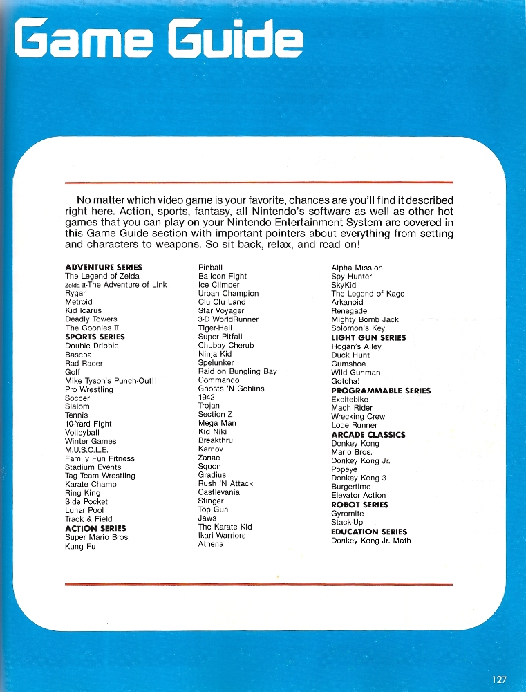
Besides the in-depth reviews, the Guide also features a, for the time, comprehensive Game Guide of all the NES games. The games are broken up into the various categories. Each category is anchored by the Nintendo offerings and then the additional games offered by other manufactures. This ordering results in Pro Wrestling being listed before Tag Team Match M.U.S.C.L.E. and Tag Team Wrestling by Data East.
The Game Guide section offers minimal insight into any of the games listed. It is simply another example of the well written summaries. Below are the three summaries:
Pro Wrestling
Tag Team Match M.U.S.C.L.E.
Tag Team Wrestling
Many people would argue that Tag Team Match M.U.S.C.L.E. never had a chance at being the most loved original wrestling game for the NES system – even if it came out before Pro Wrestling. However, if the three original NES wrestling games are objectively compared each game has positive and negative traits. Given the wild success of The Official Nintendo Player’s Guide, which featured an in-depth review of Pro Wrestling and placed Pro Wrestling first in the Game Guide, there should be some consideration to the impact Nintendo may have had in shaping the opinions of impressionable gamers.
If Tag Team Match M.U.S.C.L.E. had the in-depth review, and been placed first in the Game Guide, would nostalgic NES gamers consider it (instead of Pro Wrestling) as the best original wrestling game for NES?
Probably not. A Winner Is You!
Additional pages from The Official Nintendo Player’s Guide that feature the M.U.S.C.L.E. game:
Page 127
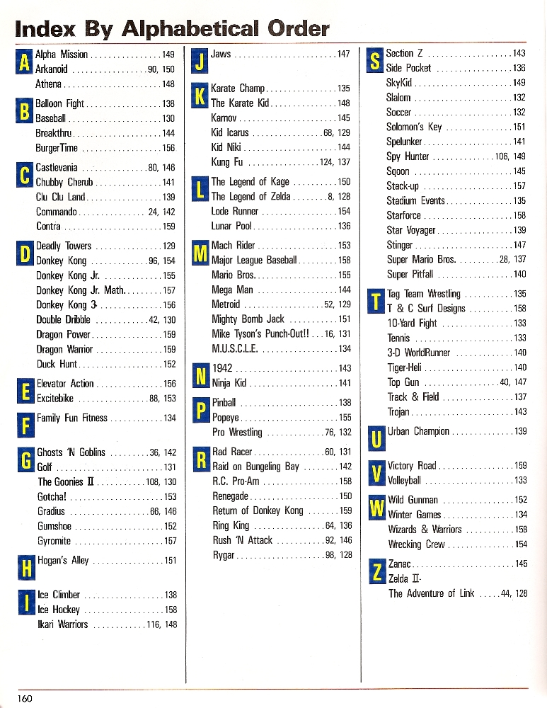
Page 160
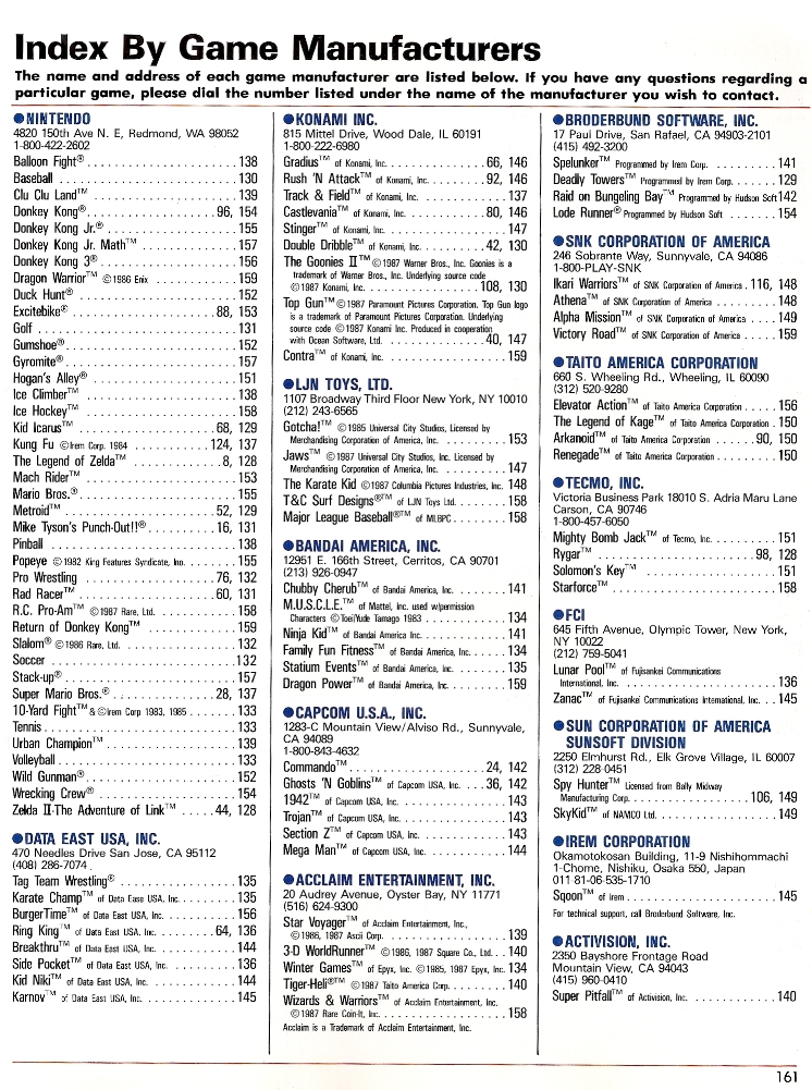
Page 161
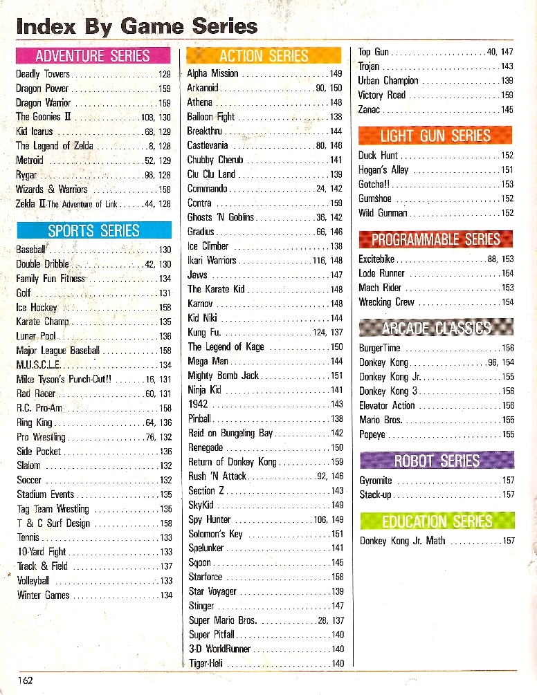
Page 162
#1 by Foxman on December 4, 2012 - 5:48 pm
Sorry, but M.U.S.C.L.E. wrestling for NES was awful. The characters remotely resembled M.U.S.C.L.E. figures… and that’s about it. One of the only times in history where full color characters were a BAD idea.
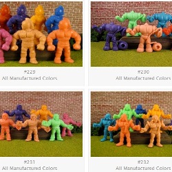
At the time it came out, the figures were pink, pink and only pink. NOBODY in the states had ever heard of a cartoon, comic or anything with full color figures aside from the very short comic strip on the back of the 28 packs. I still remember being excited to play it as a kid. It was the BIGGEST DISAPPOINTMENT… EVER.
Not only did it look terrible, the game play was terrible too. Wooden and basically broken. It was agony to play that POS game.
Pro wrestling on the other hand was a great game at the time. It had characters with signature moves and it actually WORKED. I’ll never forget “Amagon” biting the guys head 😉
It’s a shame they didn’t work a little harder with the M.U.S.C.L.E. game. They could have done so much with it if only a little more effort was put in. I think it’s a great example of the attitude held by the creators of the whole M.U.S.C.L.E. line though.
Crap something out to sell and sell the crap out of it.
NEXT!
BYE!
;(
#2 by Chad Perry on December 4, 2012 - 6:06 pm
I think your post might fit a little bit better with the History 100 section devoted to the M.U.S.C.L.E. video game.
It’s pretty easy, bordering on lazy, to look back and lambast the game. But stepping back and objectively looking at the game, some respect should be given to the game and its attempts at innovation.