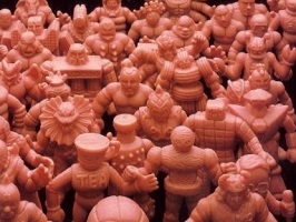
 Many times I’ve suggested you need to own a figure before you can fully judge it. When I original noted this group of figures in AW #248 I made a mistake. I thought there was a custom figure I might want. I ended up paying $15.50 for what I thought was a custom figure and some other stuff.
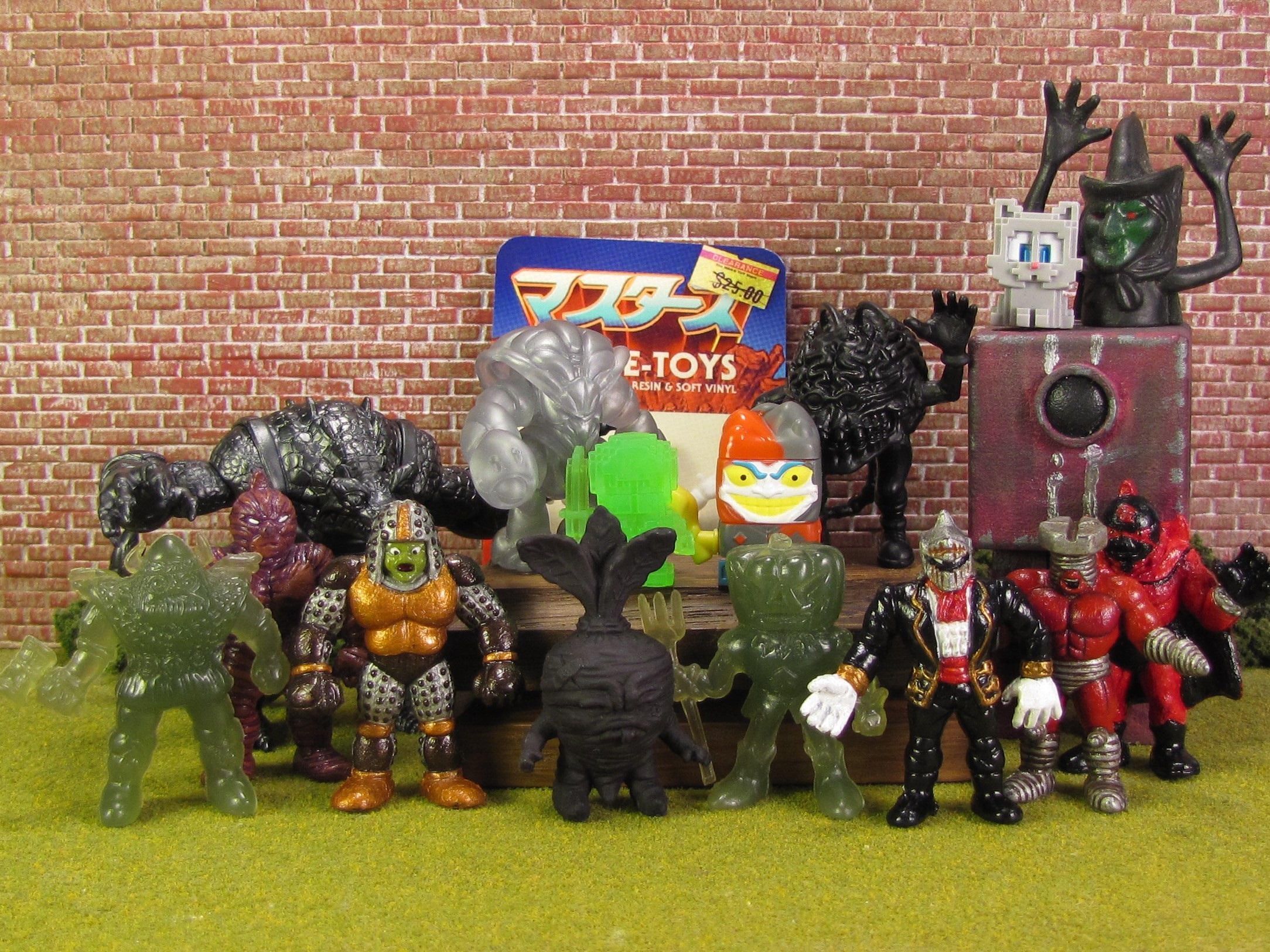
I thought there was a Namu Niku figure. I was wrong. I had paid $15.50 for a bunch of figures I didn’t want. But as I looked through the figures I was struck with many different thoughts and emotions. How was I going to post these figures on the website?
I decided to break the figures into two groups. Part 2 will be coming soon. In the very loosest-sense Part 1 is more Art 200 focused and Part 2 is more Art 300 focused.
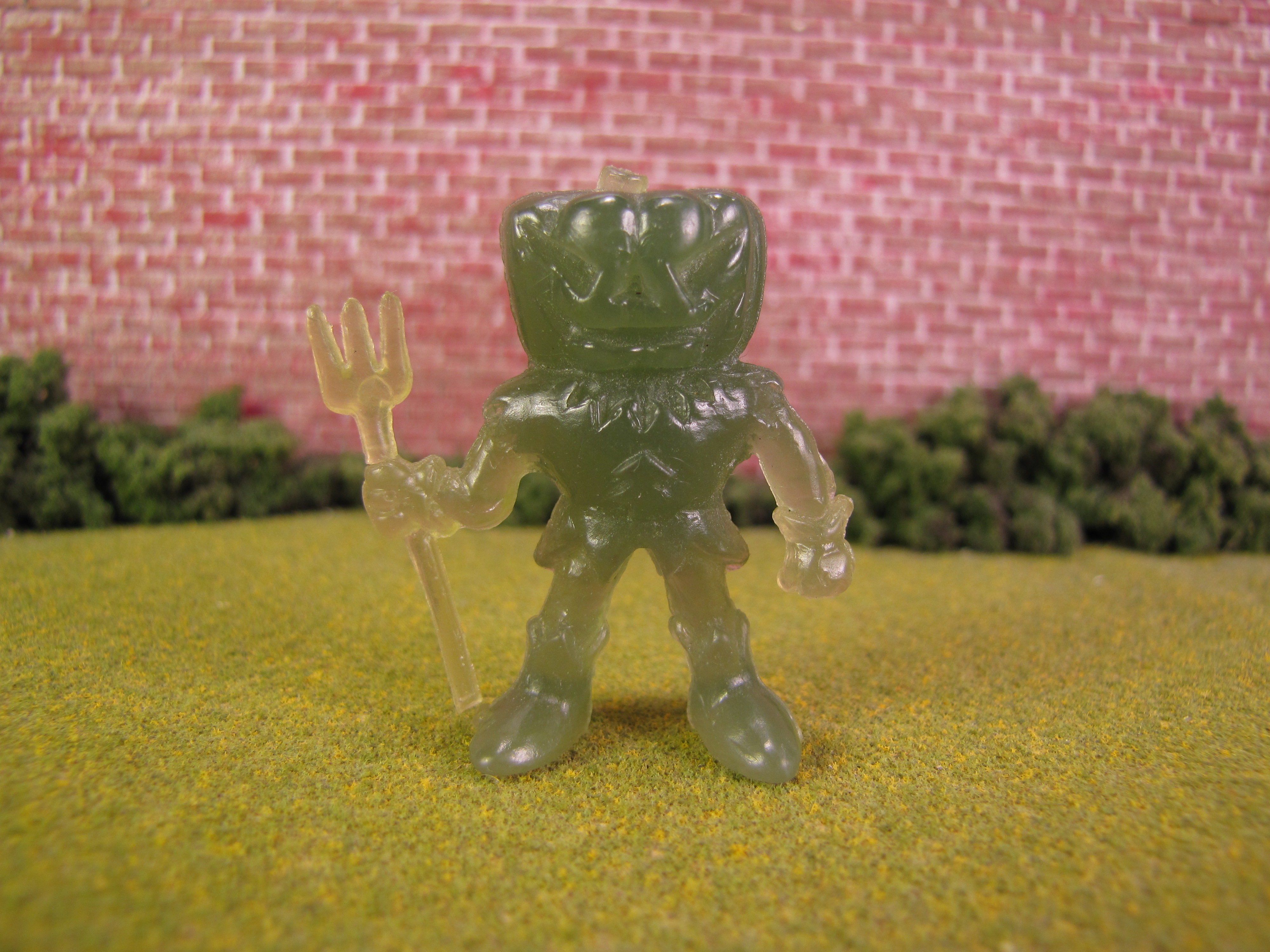
Pumpkin
Thanks to NeclosFortress.com I was able to easily identify the figure as Pampkin (Pumpkin). I’m surprised that I still like it. The figure is pretty damn cool. I especially like the coloring of the figure.
As an entire line, I can’t say that I really like them. But I’m not foolish enough to suggest I don’t like some of the sculpts.
I can’t remember the last time I bought a mixed lot like this one. The fact that I ended up paying about $0.91 per figure makes it very easy to swallow. I’m glad this figure tricked me into exploring some new figures.
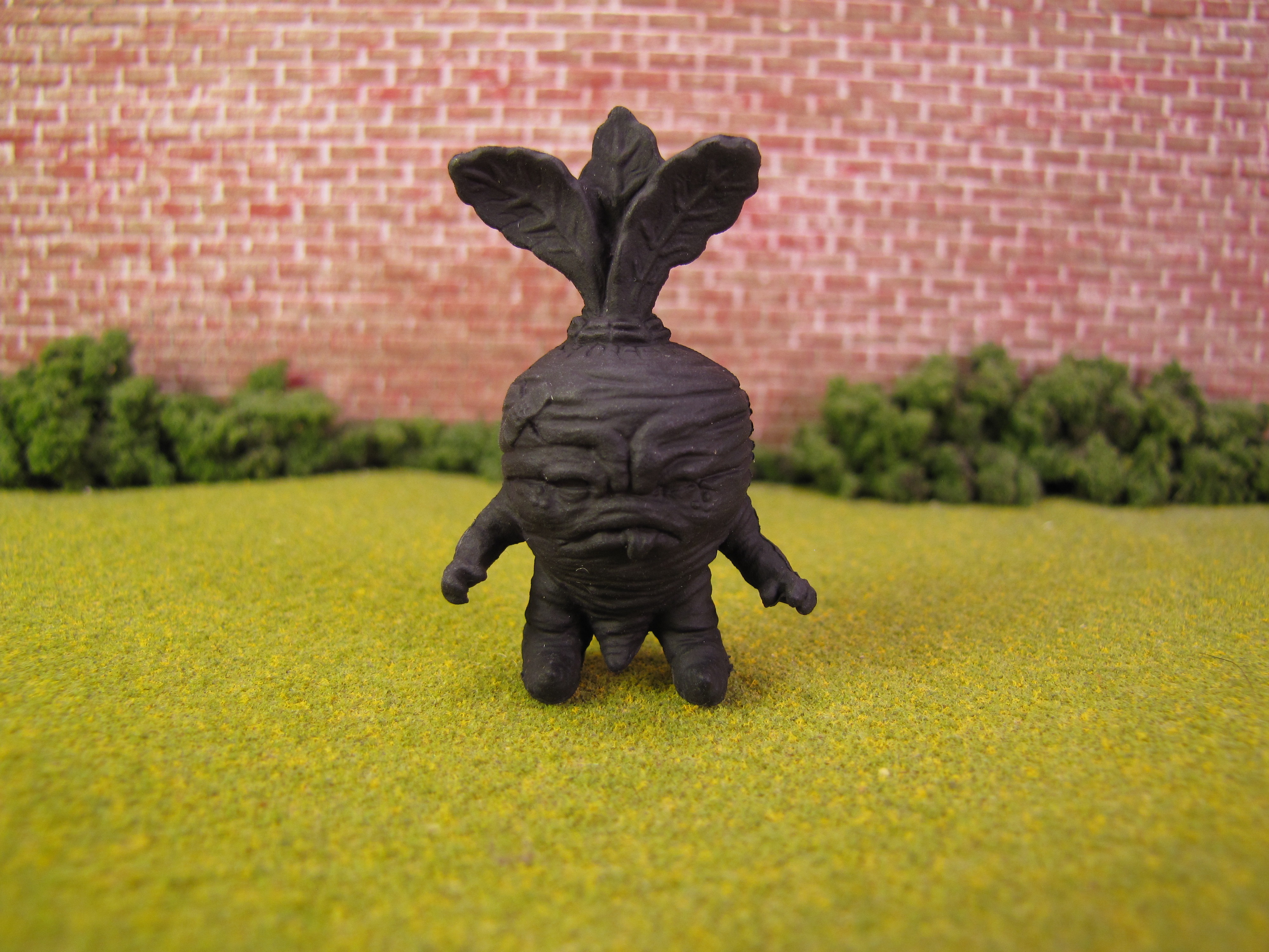
Baby Deadbeet
The Deadbeet figure was larger. This is a Baby Deadbeet figure and was a part of OTMFG. When I found the checklist I was a little surprised. I assumed I would easily find the Black version of the figure. This figure is certainly not Midnight. Maybe it’s Stealth Color Change?
The figure is well sculpted, but I don’t really like it. The easiest explanation is that it’s a piece of art that I don’t like. I can understand why some people would like it, but it doesn’t move me. He seems more like GrumpyBeet than a DeadBeet to me.
After learning a little more about the figure I’m shocked that there are 29 different color versions of the figure. Clearly I’m in the minority of not liking this figure.
Back
Front
There was a card with some of the figures. I assume this artist, that included the card, painted most of the figures.
I say most because the quality of the paint-job on the #92 figure is much lower than the other four figures. Let’s start by taking a look at the painted #92 M.U.S.C.L.E. figure.
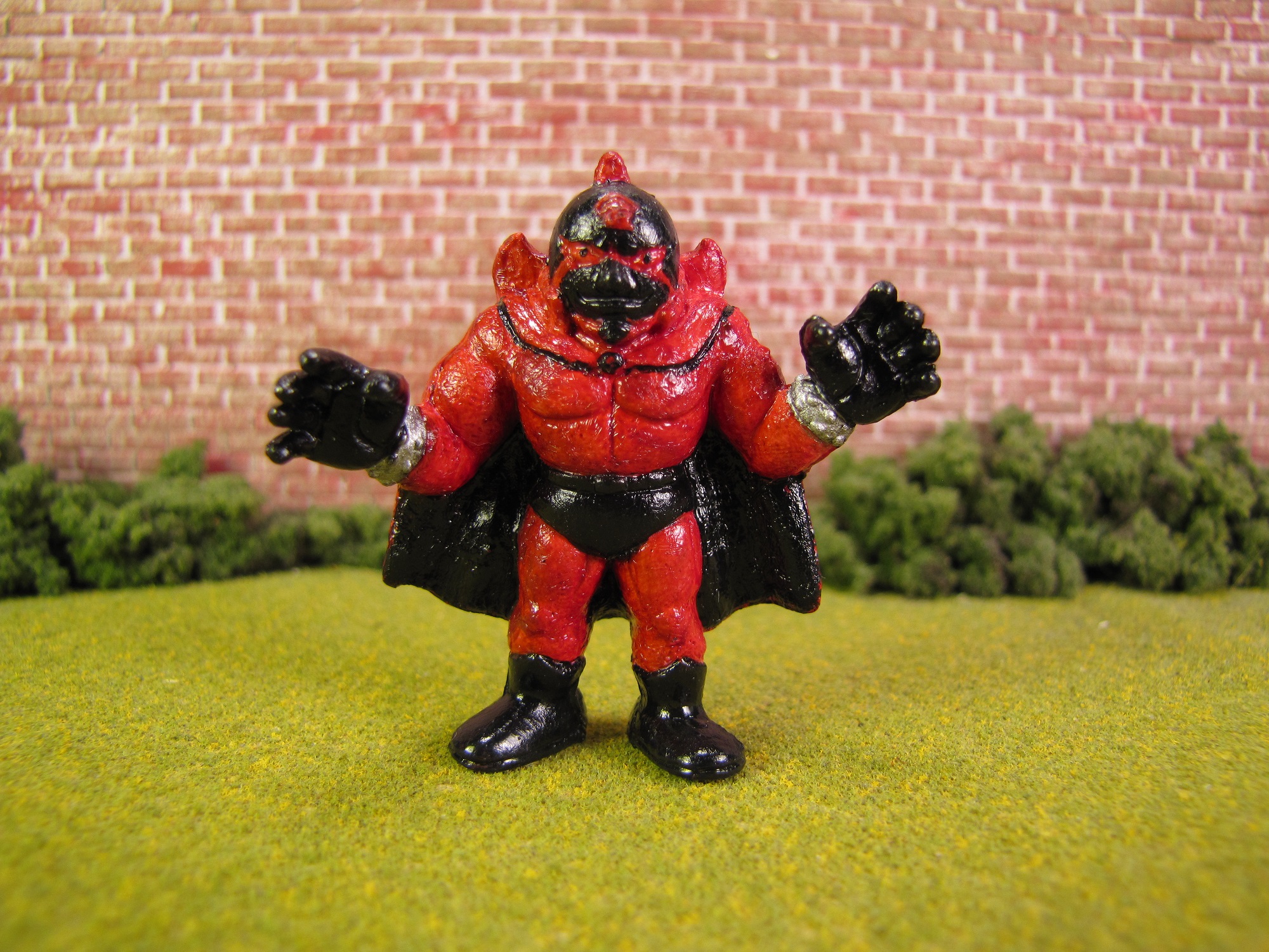
Painted #92 Figure
If it is supposed to look like this, then I really hate this figure. Way, way, way too much red on this figure.
The paint-job looks…clumpy? I don’t know how to explain it. Maybe they used too much paint? I know it sounds awful, but the figure simply looks bad to me.
Ultimately, the biggest problem is the eyes. Wonky eyes are a kiss of death for any figure. No matter the toy, wonky eyes standout from across the room. Wonky eyes are the kiss of death. Maybe this figure was painted by the same guy as the four figures below, but I would be surprised. This #92 M.U.S.C.L.E. figure looks bad.
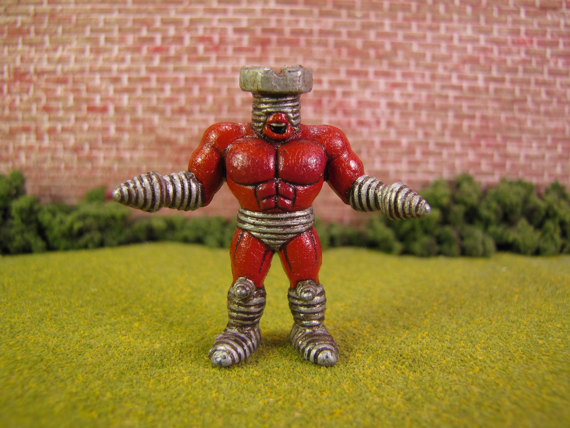
Painted #149 Figure
I think the screws are the highlight of the figure. The screws look worn and slightly rusted to me.
Of course, maybe I just like this figure because the art speaks to me. I see it more positively because I like it.
I do think the silver teeth are an interesting choice. If I was asked, before painting, then I probably would have said, “Geez, I think that’s going to look weird.”
I would have been 100% incorrect. I think it looks awesome and makes sense for the character.
Because I like the silver screw pieces so much I think I could live with the body being almost any color. It could be red, blue, green, or any other color – as long as the silver screw pieces look so good.

Painted #66 Figure
Does anyone else see that matador-like look?
It creates a very interesting figure. I’m still undecided if I like it. Often I have found that thinking a figure is interesting enough for me to like it.
This figure feel like the artist took a little bit of aa chance, but maybe they didn’t go far enough for me to be in love with it. Art that surprises me and does something different is often my favorite.
Making that statement certainly paints with a broad brush, but I think the last two figures support it. The figures are painted in unexpected colors but, in my opinion, they totally work.
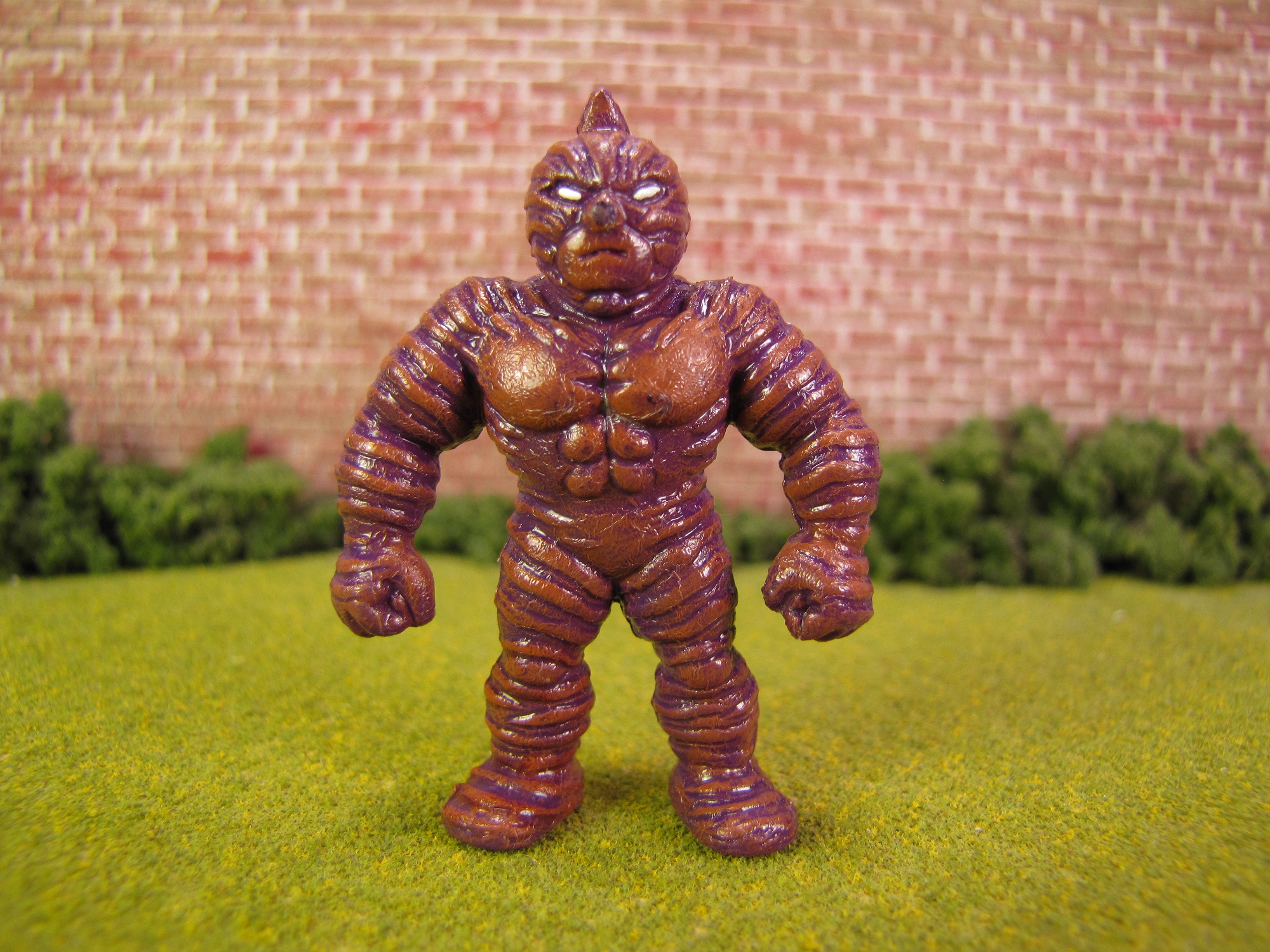
Painted #85 Figure
I never would have thought or suggested these colors, but it looks awesome.
And if wonky eyes can kill a figure, then perfect eyes can make the figure. These white eyes look amazing. It feels very Batman-like to me – and I absolutely love it.
I wonder if collectors agree with me on this figure? I can imagine some collectors not liking the color combination. It’s hard for me to imagine, but I recognize it could happen.
Could fans of painted figures fall into specific categories? Maybe traditional vs. unusual? I could imagine a traditional fan preferring the painting of the #149 figure. The unusual fan is probably going to prefer the #85 figure.
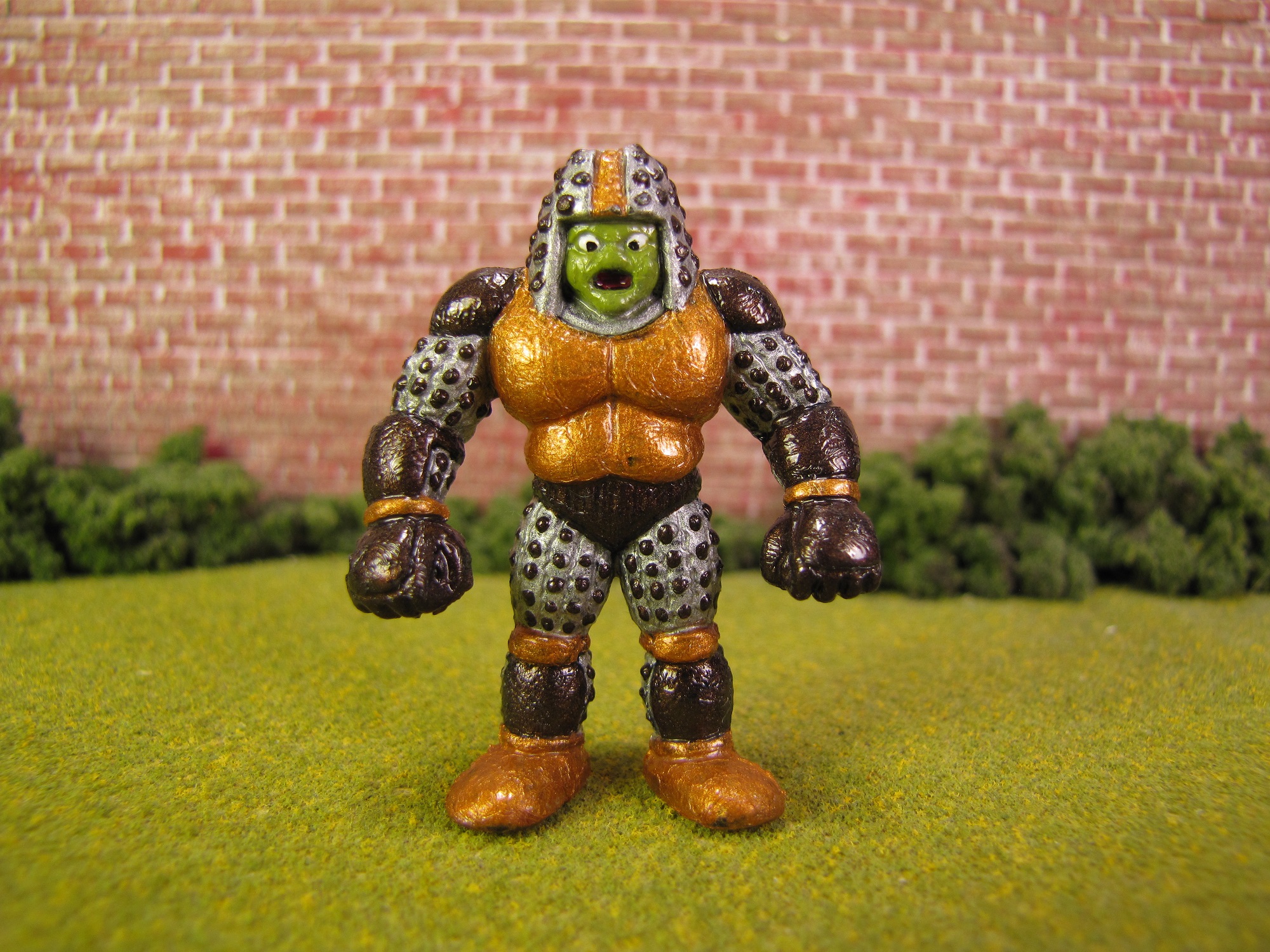
Painted #106 Figure
This figure wasn’t my favorite, but I really like it. Again, the artist has decided on unusual colors and I think it looks great.
The very subtle part of this figure is the mouth. There is a red-ish tongue/bottom of the mouth. I think it gives the figure a much more reptilian feel that wouldn’t have been achieved with only green skin. You’ll probably need to click on the picture and zoom in to fully see it.
Do you agree?
If you guys know anything lese about these figures, then please post it in the Comments below.
The rest of the figures, from the entire lot, will be reviewed in Minifigure Potpourri – Part 2.